Alida
Alida

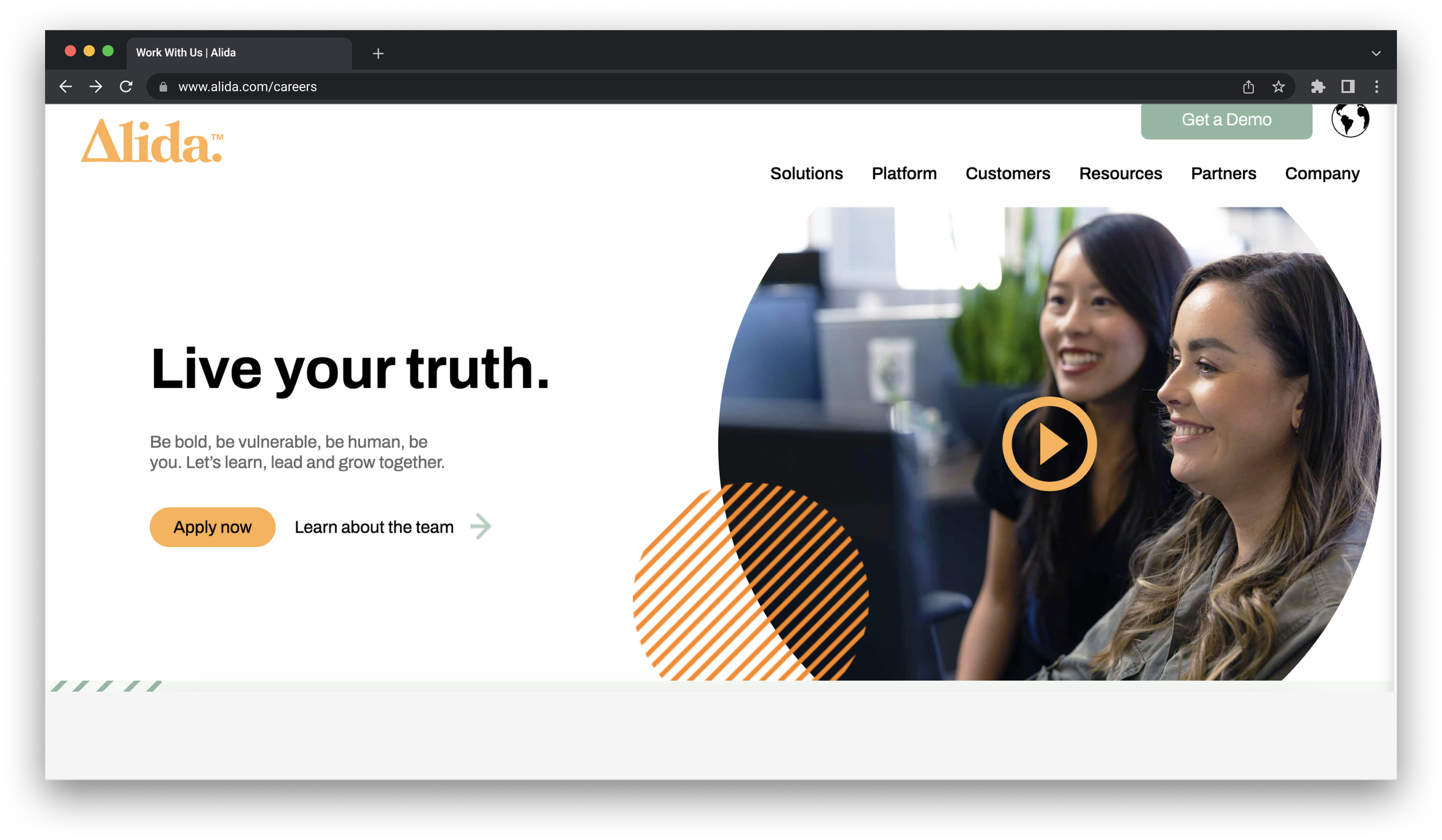
As a Lead Designer on this project, my team was asked to redesign Alida’s career and team pages and update their visual identity. Following multiple iterations over a 6 week engagement, Alida was pleased with our final deliverable. They were impressed with the pages' design and how we enhanced their brand and content. You can visit the careers page now by clicking on this link: https://www.alida.com/careers.
What We Built
My Role
Lead Designer
Tools
Figma, JIRA, VS Code
How We Built It
The first step of the project was to understand the client's request. Alida's goal was to modernize their website, starting with the Careers page.
During a design audit, we found ways to improve the page such as consolidating content, updating branding elements, and highlighting visual assets.
Before beginning the design process, we collected Alida's visual elements such as photos, videos, icons, colors, and typography. The goal for the art direction of this page was to create a warm and inviting atmosphere that reflects Alida's color palette. We included visual elements that reflected the desired mood, such as group photos and geometric icons.
Careers page as of May 2022The initial iteration of this page focused on establishing layout and sections in order to efficiently curate content and visual elements.
For the initial version, I crafted the webpage with a focus on storytelling. The aim was to lead the visitor through the content, imparting knowledge about Alida and what distinguishes it as an employer. At the end, the visitor would arrive at a job board to explore available positions.
The approach was appreciated by the client, but they had a different idea in mind. They wanted the careers page to highlight Alida as a company and keep the job board separate to avoid overwhelming visitors and cluttering the page.
Design Approach & Iteration
After carefully considering all the feedback we received on the initial version, we made significant improvements in version two. The most notable changes include a visual update that incorporates more shapes and icons, a minimalist approach to sections like "How We Work", and a creative display of our office location with timezones.
The client gave version two great feedback, praising its clean and minimal design. Despite the abundance of content, they were impressed with our use of negative space to prevent overwhelming the reader as they navigate through the page.