Rogers Bank
Rogers Bank
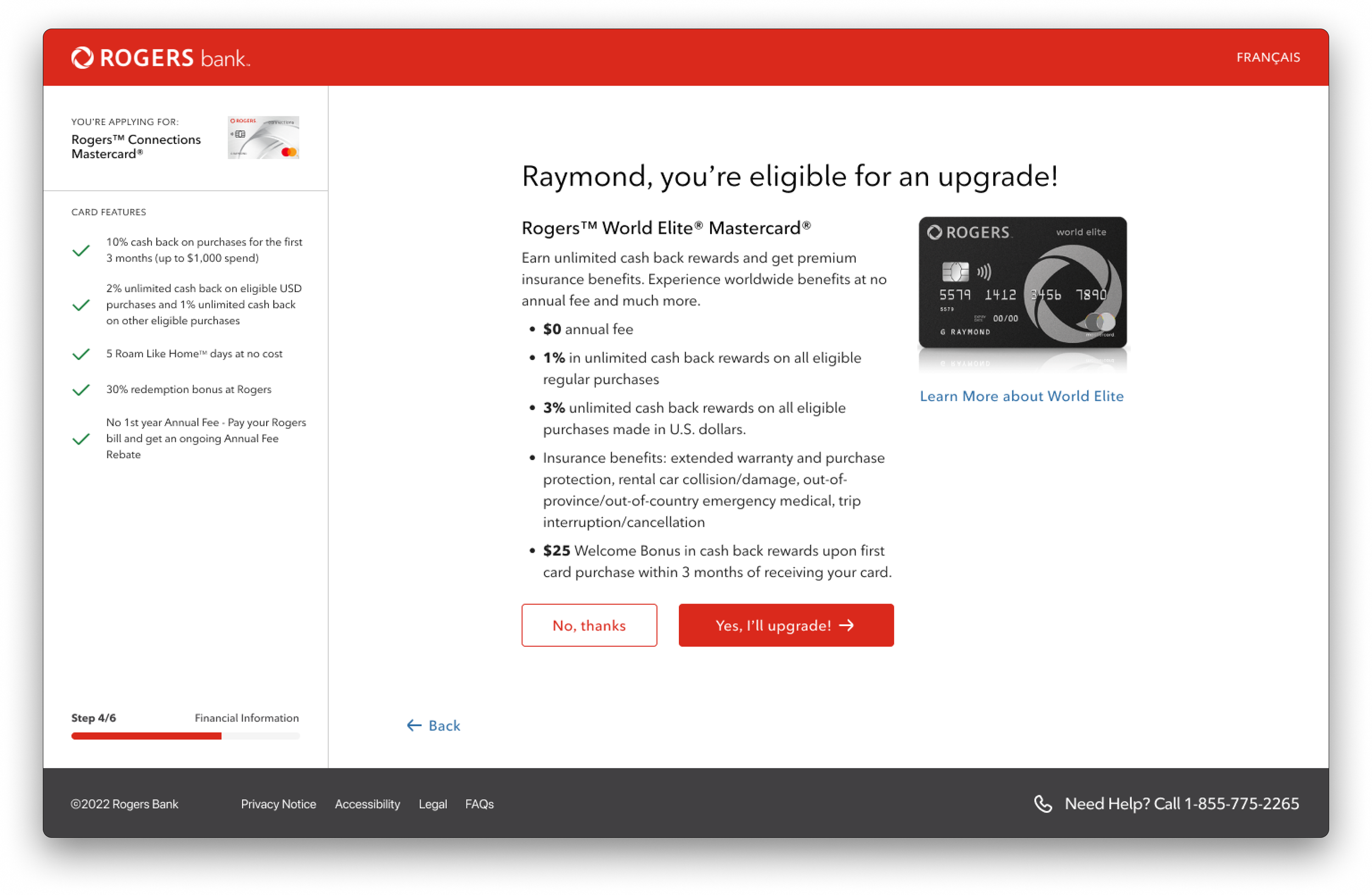
The focus of this project was to fully redesign Rogers Bank’s credit card application. The updated application can be found here: https://rogersbank.com/en/rogers_mastercard_details
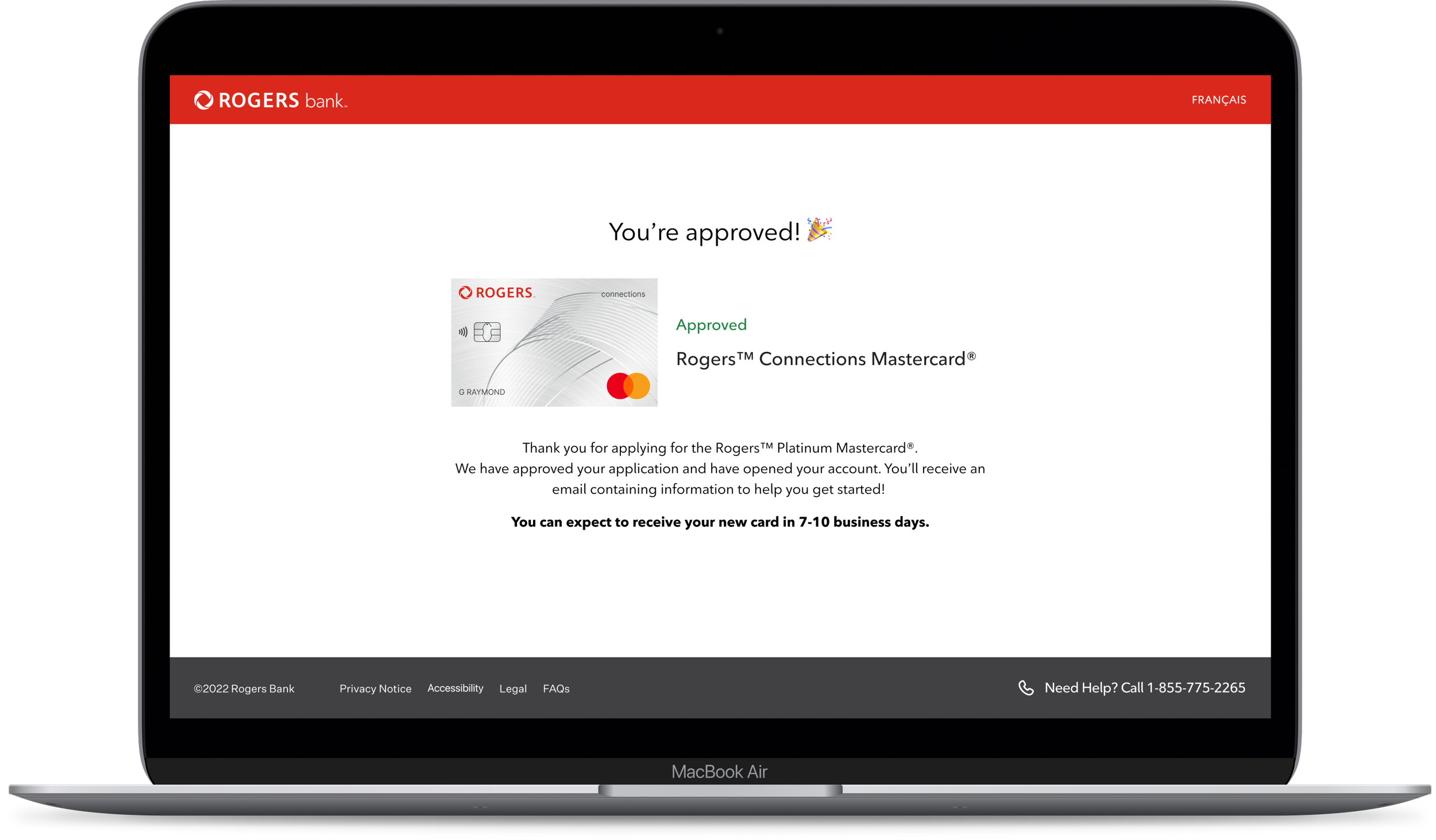
This flow was received well by test users and the client. The updated flow fulfilled their goal of developing a guided, focused experience, decreasing cognitive load, and ensuring security for the applicant. The landing pages also satisfied the customer’s need to know more about the Rogers Bank brand, its offerings, and how the products can benefit them.
Project Overview
My Role
Product Designer
Tools
Figma, Sketch, Abstract, JIRA, Confluence
What Problem Are We Solving?
Feedback received from internal stakeholders and applicants indicated that the current application form may benefit from an update to better align with modern standards.
Many individuals seeking to complete the application form have expressed feelings of being overwhelmed by the sheer volume of information presented to them. This sense of being overwhelmed has led to a significant number of applicants ultimately deciding to abandon the process altogether.
After reviewing the data, we decided to create a simplified user experience that would increase conversion rates while reducing cognitive load.
Design Approach & Thinking
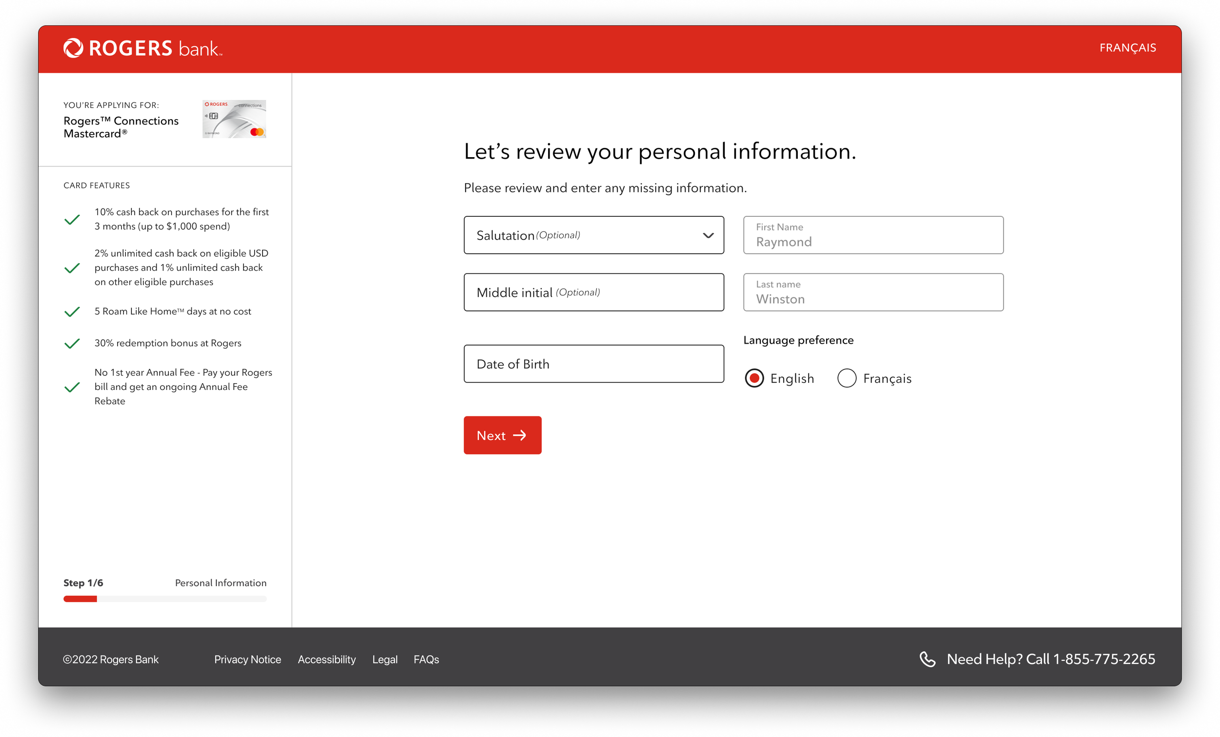
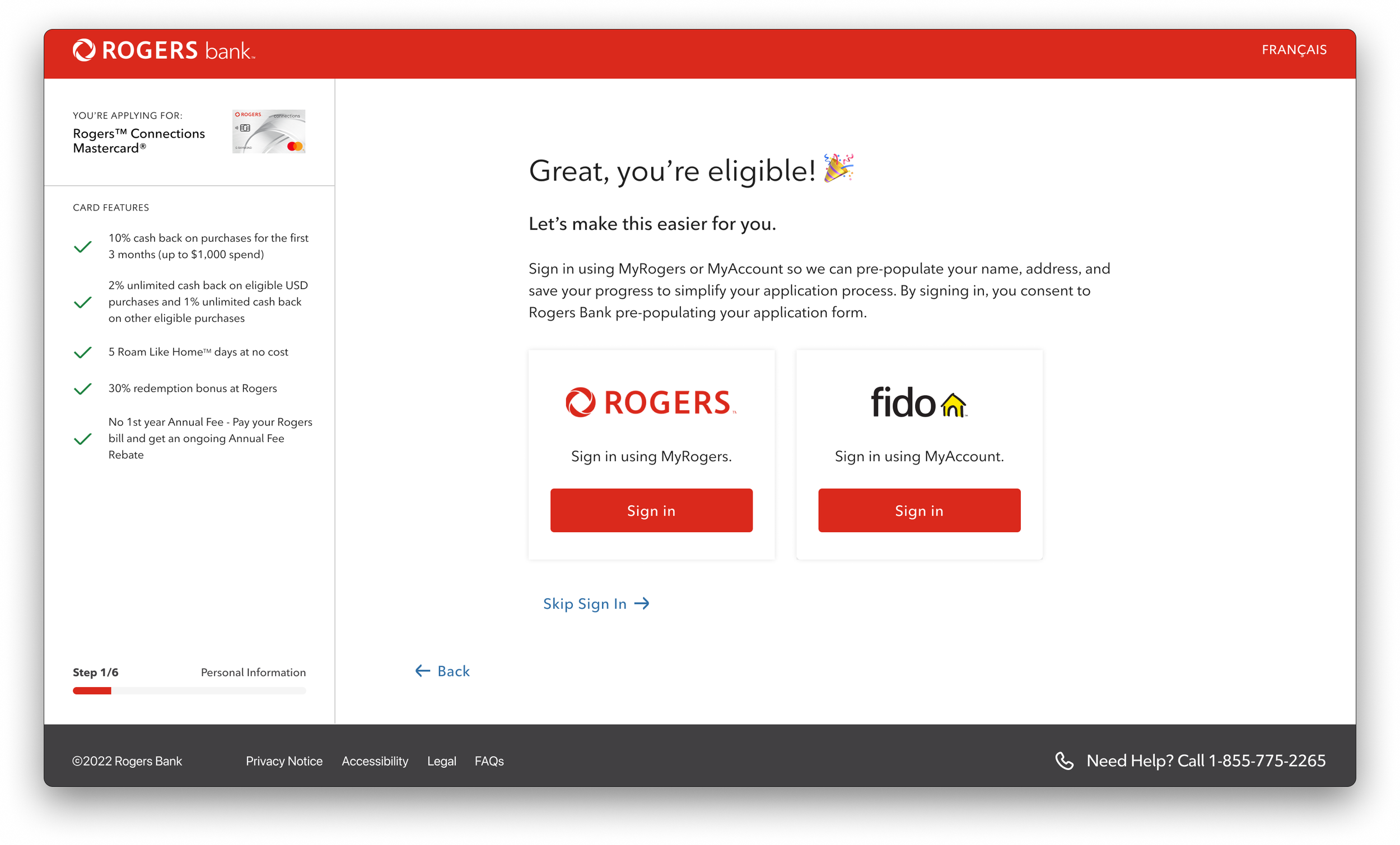
We designed the application based on onboarding flows implemented by companies like Wealthsimple, NEO Financial, and Scotiabank. This onboarding pattern allowed the experience to address one of the key items we discovered in our research: decreasing cognitive load. Segmenting the application into multiple parts gives the user an expectation of how long it will take to complete, updates them on the progress they’ve made, and allows them to prepare all the relevant information they need to complete the form successfully.
Our research goal was to clearly define what to build and for whom. For this particular project, the client’s core audience was a predetermined group of “eligible users”. This cohort was determined by Business Analysts who performed studies and analyses of existing customers who fit criteria that included customer longevity, services they've subscribed to, and their likeliness of applying for a Rogers Bank product.
As for the “what”, we received customer sentiment data from the client that outlined that Rogers customers had limited knowledge of the bank brand and their offerings and found the application to be overwhelming.
The research findings allowed us to understand 3 key items:
Design an experience that would decrease the cognitive load.
Ensure customer confidence in the Rogers Bank brand.
Ensuring the customer is constantly aware of what product they’re applying for.
Initial Research
eKYC Implementation
To ensure the safe and secure delivery of products to customers, an additional layer of security has been incorporated. This is done through e-KYC (Know Your Customer) verification, which enables customers to quickly and easily verify their identity, thus streamlining the acceptance process. This can be done on a mobile device or in person at any Rogers or Fido store, in case the customer does not have access to a mobile device.
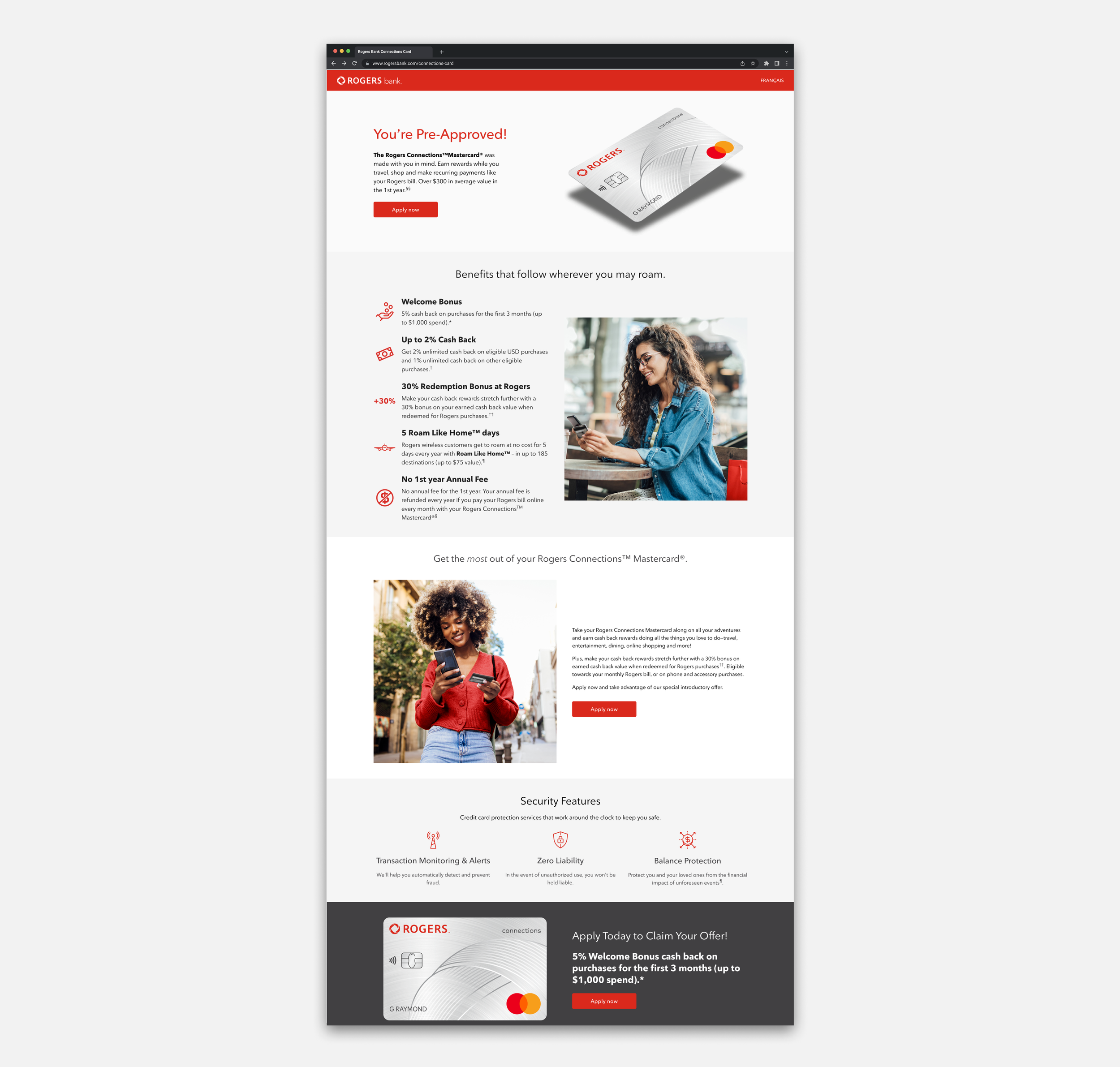
Marketing & Branding Pages
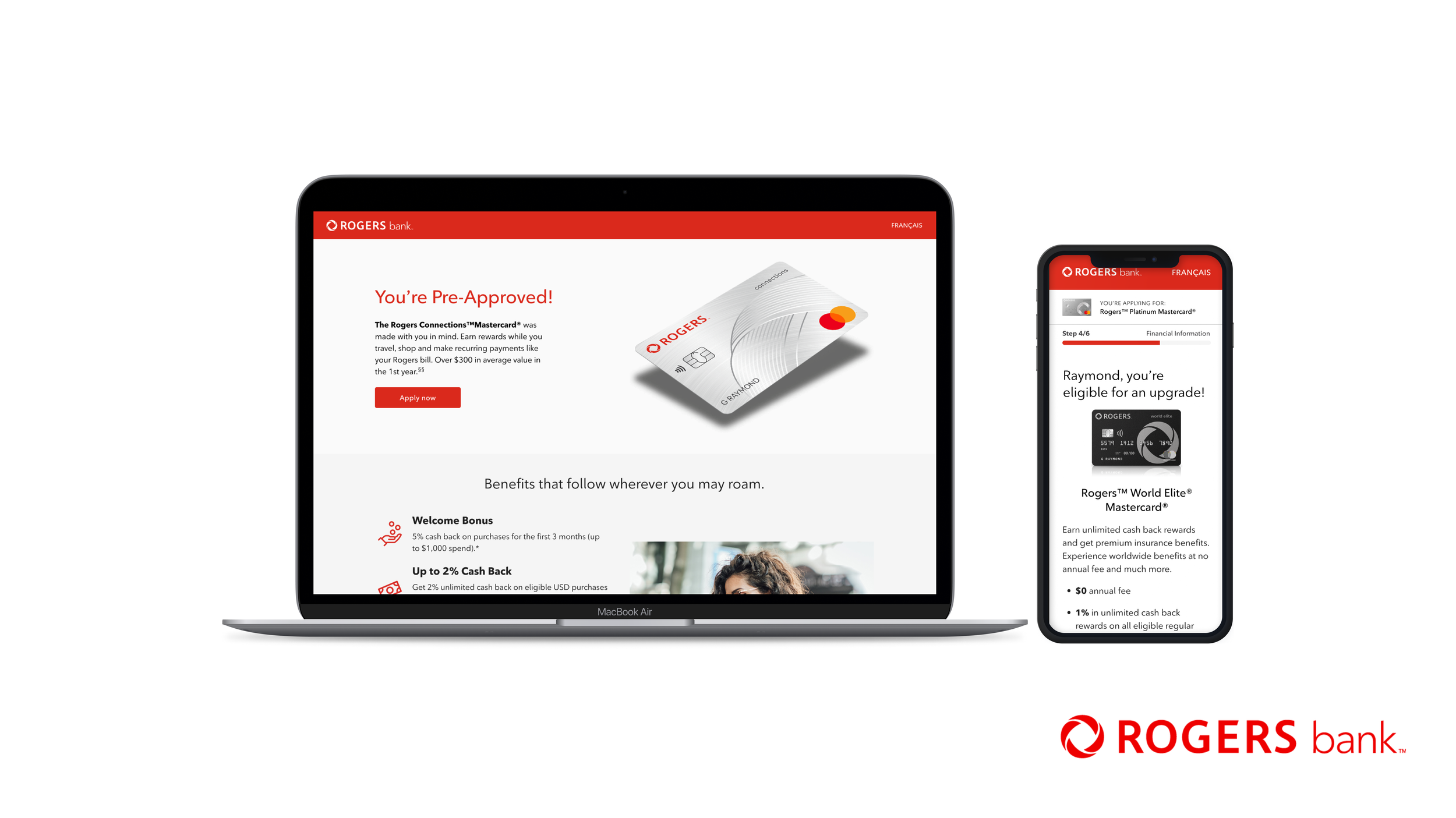
The product and its benefits were the star of the landing page. It was important for us to emphasize what the product offered, how it can be best suited for the customer, and emphasize the Welcome Offer. Our goal for the Welcome Offer was to have it resonate with our target customer and set it apart from competitors in the market.
The Lessons
Like all projects, there are things we learn along the way and things we wish we could’ve done (either better or different). Here are a few things I learned during this project:
Collaboration is the key to a successful project. Having everyone on the same page and bought into the vision helps a lot. Communication and vulnerability is the key to this, especially with a big project team and a lot of stakeholders.
Working with a large engineering team can be intimidating at times, but so rewarding. I was able to work closely and often with our engineers and it helped us get into a groove where we were able to ship new pieces of the flow efficiently.
Things change often, and so should you. Since this was one of my first agency projects, there were moments when we had to pivot. This can be frustrating at times, but also an opportunity to adapt your designs while keeping the integrity and quality of it intact.
