Project Overview
The purpose of this project was to enhance the shopping experience for our patients. Based on data gathered from research patients found purchasing and searching for products tedious.
By implementing enhancements including dynamic product filters and detailed product pages, we noticed an improvement in customer satisfaction and increased revenue. Patients found searching for products they had previously purchased much easier and expressed a better understanding of the products they were purchasing. I addressed the key issues our patients were facing, and I'm happy that we were able to deliver an improved way to shop for medical cannabis products. You can visit the shop @ https://www.auroramedical.com/collections/all
In addition to improving their shopping experience, I was able to provide Aurora's design team with a foundational design system and information architecture to support their growth.
Lead UX/UI Designer
UX Researcher
Interaction Designer
My Role
Tools
Figma, VS Code, JIRA, Confluence
What Problem Are We Solving?
This project aimed to tackle two main concerns: patient enrollment and online shopping.
Aurora was experiencing poor patient sentiment due to the less-than-ideal shopping experience and enrollment process which negatively impacted monthly revenue.
My goal was to understand why patients were unhappy with the e-commerce experience and what their ideal experience would be.
Design Approach & Thinking
One of my main responsibilities was to conduct research methods to validate assumptions based on the enrollment process and overall online shopping experience.
I performed user interviews, analyzed surveys, and website data to understand patient sentiment and pain points. Some of the key takeaways from the research included:
Most patients had a considerable knowledge and experience gap when it came to cannabis products.
Product discoverability was not as intuitive as competitors and was a major patient complaint.
10% of Customer Care calls are from patients placing an order.
Patient enrolment was not straightforward and 20% of customers abandoned this process.
Initial Research
Based on our data, we decided to tackle the e-commerce experience first, as the enrollment process involved dependencies within Aurora, which added complexity to this project.
The key areas of the shopping experience we wanted to improve were:
Product listing page
Product Description page
Cart page
Throughout the project, I gathered vital feedback from stakeholders and customers through usability and A/B testing, utilizing clickable Figma prototypes. This collaborative approach significantly influenced the final product and its positive outcomes.
Design Direction
The improved e-commerce experience emphasized product discoverability and information. I aimed to provide patients with an experience that would empower them to make informed decisions that would help aid in their treatment.
Patterns such as product variants in the product card and a detailed product description page made for efficient and educational shopping experience.
Final Designs
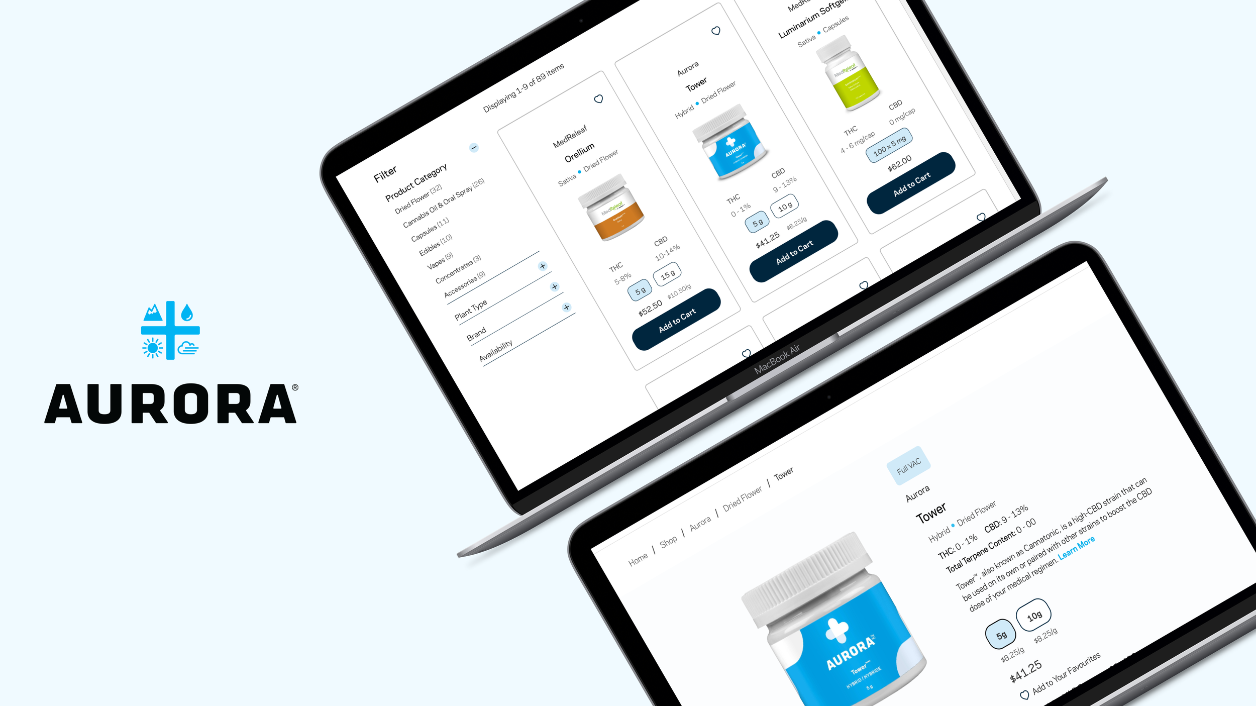
The Product Listing page was overhauled, introducing a dynamic filter that simplified product discovery. This dynamic filter provided patients with precise parameters to quickly locate products from a vast inventory, addressing a previous challenge. We also revamped the Product Card, enabling patients to view product variants, compare prices, and swiftly add items to their cart.
Product Listing Page
Additionally, we improved the Product Description page with educational content, including Terpene Profiles, Genetics, and How to Use information, empowering patients to make well-informed purchasing decisions.
Detailed Product Page
In addition to a new Order Limit indicator on the Cart page for prescription tracking, we introduced product recommendations to enhance the shopping experience, resulting in a user-friendly, informative cannabis e-commerce platform.
Dynamic Cart Page
Initial Results & Outcomes
*based on 60-day post launch data8%
reduction in phone orders
increase in customer satisfaction
9%
17%
increase in monthly revenue
“I have a better idea of which products are right for me. And I’m glad I can finally shop with ease.”
Trevor H., Aurora Customer
The Lessons
As the sole designer on this project, I had to learn many things on the go. This experience has helped me realize the enormous effort that goes into a project, including planning, testing, implementation, and more.
There were definitely moments when I had to learn how to run before I could walk. It was overwhelming at times, but it provided me with an opportunity to learn quickly and adapt to my environment. I am grateful for the chance to work on this project and was committed to creating an experience that helped people easily access the medication they needed.

