Simplifying a credit card application
Rogers Bank's credit card application put every field on one long page, and applicants felt it. Working in a two-person design pod, I designed and iterated a guided 6-step flow that raised conversion from 78% to 87% in a phased beta.
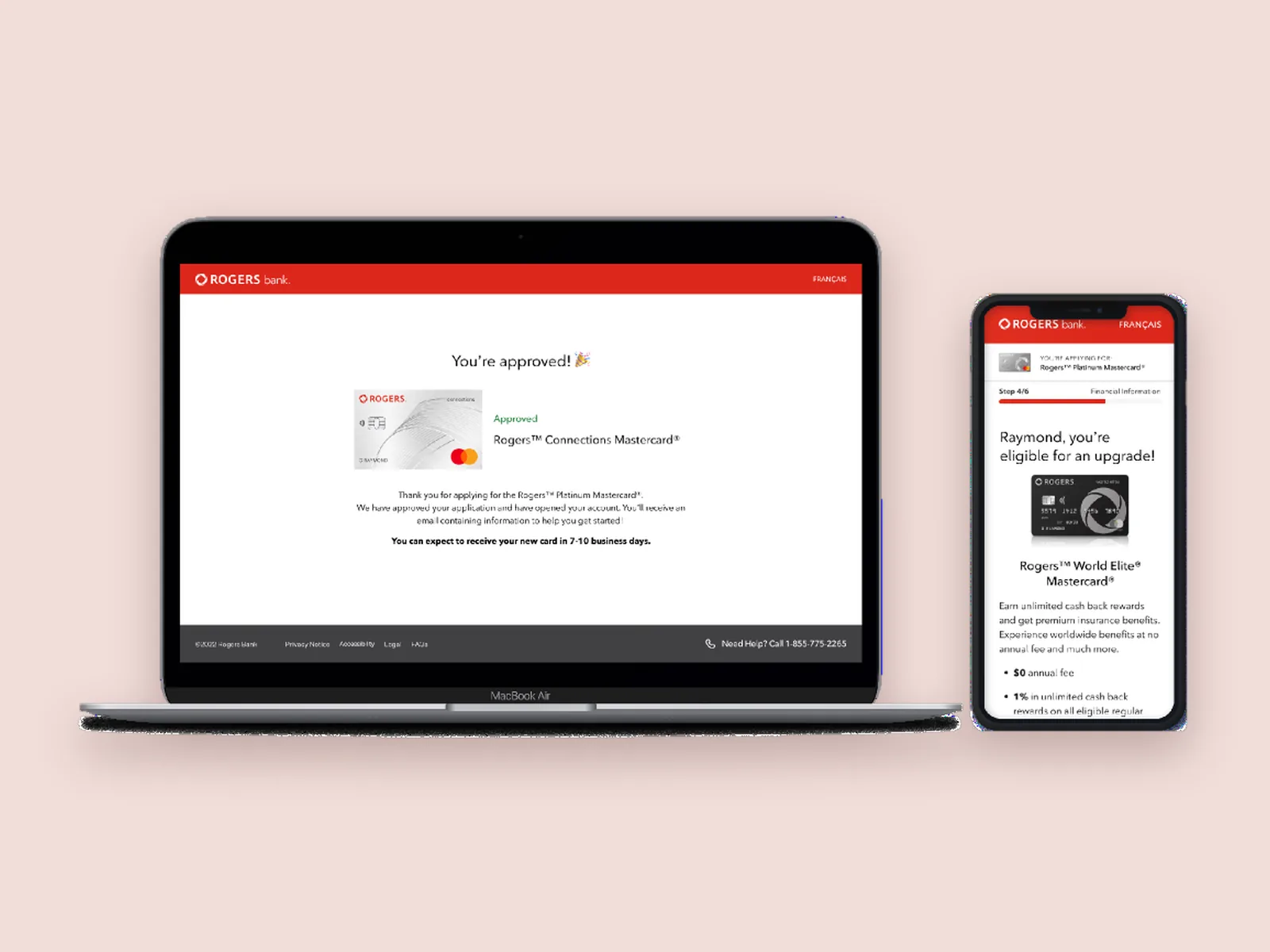
- The tension
- A dense, single-page form from a bank most applicants didn't recognize felt overwhelming and, to some, not quite legitimate.
- The turn
- We broke the form into six guided steps, placed the upgrade offer where it helps rather than confuses, and made identity verification work across devices.
- Where it landed
- Conversion rose from 78% to 87% and satisfaction by 23%, with eKYC as the biggest single driver.
Problem
A wall of fields from a bank people didn't know
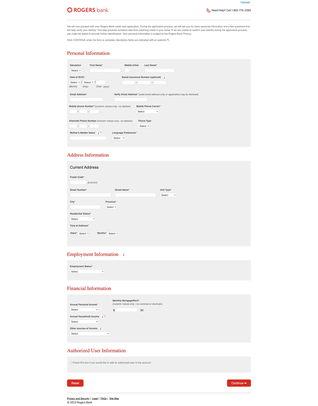
The original application asked for everything at once: personal details, address, employment, finances and authorized users, all on one page with no sense of progress.
Research
Working from the business's own data
Rogers' business analysts owned the research. They defined an "eligible users" cohort, existing customers selected by tenure, services and likelihood to apply, and their sentiment data pointed to two things: the form was overwhelming, and the bank was unfamiliar.
I studied how Wealthsimple, Neo Financial and Scotiabank structure multi-step onboarding. Segmenting an application sets expectations for how long it takes, shows progress as you go, and lets people gather what they need before they need it. That gave us three principles:
Exploration
Two decisions that shaped the flow
Where the upgrade offer appears
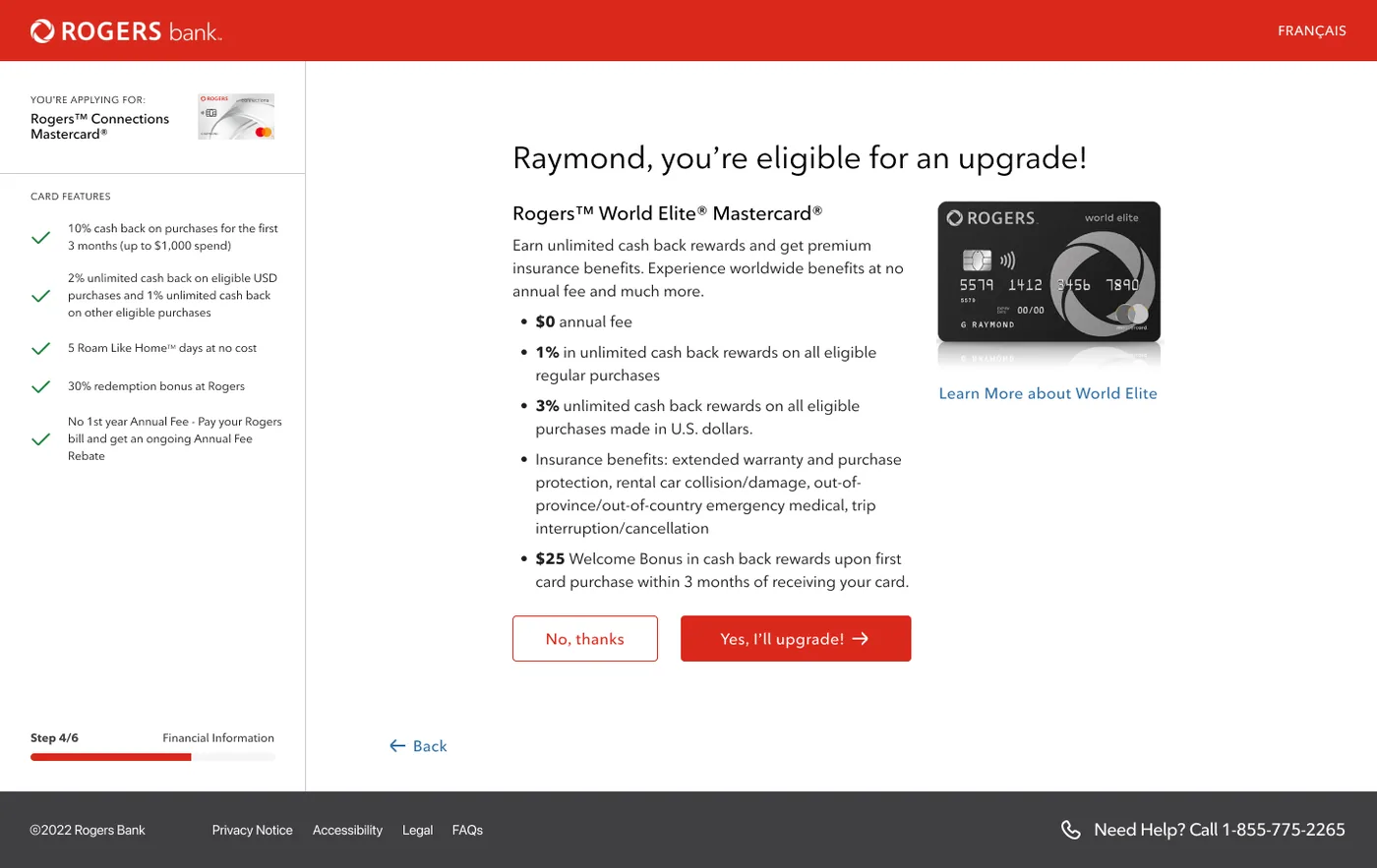
Rogers wanted the World Elite upgrade tied to the customer's profile at sign-in. We argued for triggering it at the income step instead. Applicants arrive expecting the Rogers Connections card, so an upgrade before they've started muddies which card they're applying for. Mid-flow, it lands as a reward for a qualifying income. Rogers agreed, and the offer now appears at step 4.
Terms and conditions without the wall of text
Legal needed applicants to be shown the full terms. We needed them not to abandon at a long legal scroll, especially on mobile, where most applications were expected. We put the terms in a contained, scrollable frame within the step: the full text is presented, which satisfied legal, but it no longer pushes the rest of the step off screen.
Solution
A guided application, six steps long
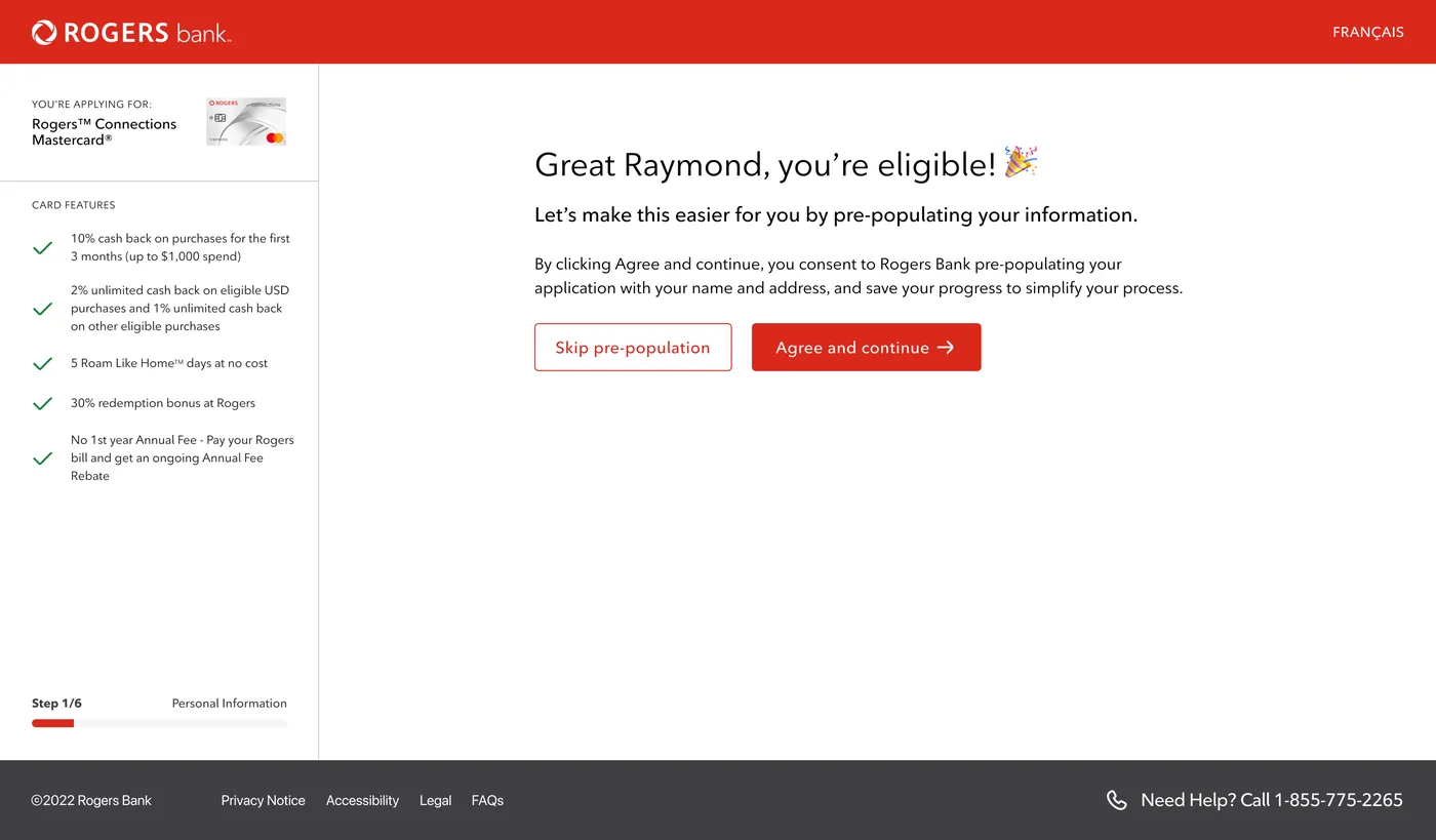
Each step shows progress and keeps a summary of the card on screen, so applicants always know where they are and what they're applying for.
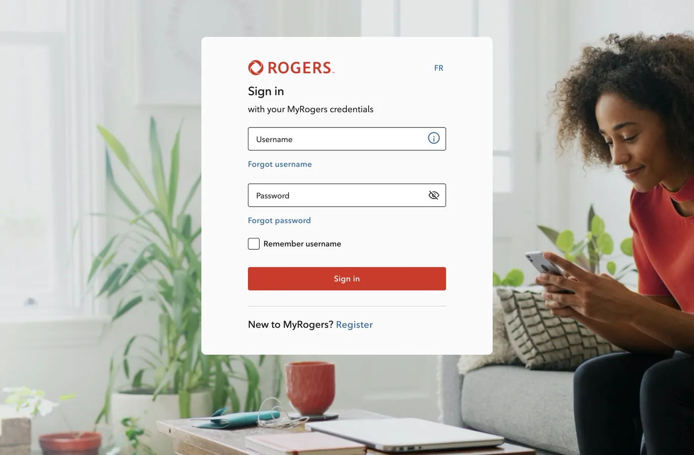
Sign in, then skip what Rogers already knows
An upgrade offer, at the right moment
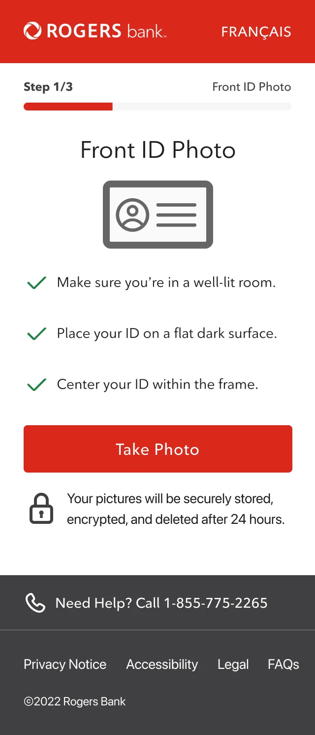
Identity verification that works across devices
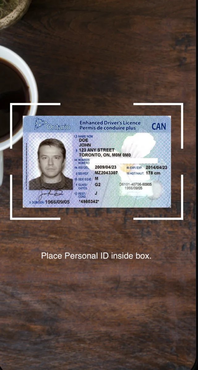
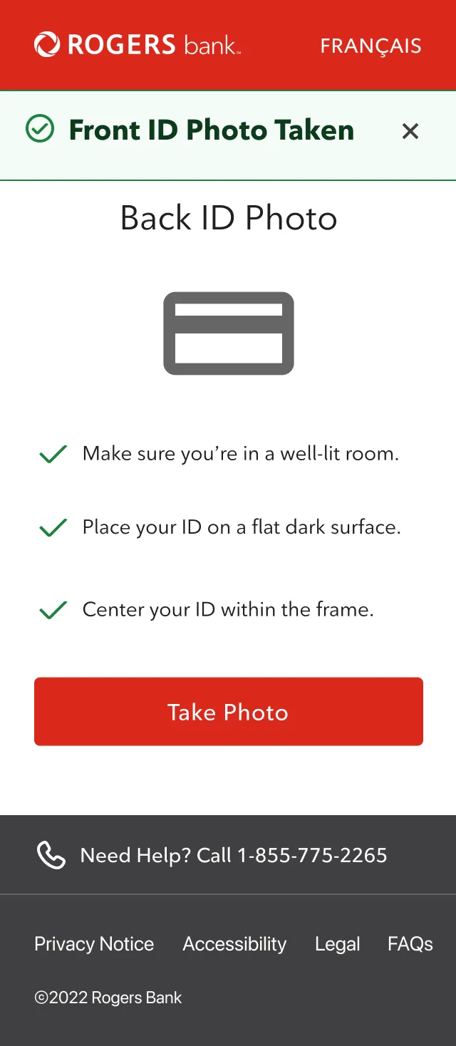
eKYC adds a security layer for card delivery and can be completed on mobile or in-store. Applicants who start on desktop can finish on their phone without losing their place.
Impact
More applicants finished, and trusted it more
Rogers ran a one-month beta, phased by cohort to match its target demographic. Conversion rose from 78% to 87%, and satisfaction rose 23% against the previous flow.
Reflection
Learning how enterprise work actually moves
This was my first enterprise client. Most of the work happened between teams: business analysts, PMs, executives and legal, each with different priorities.
The upgrade-offer decision only landed because we explained our reasoning in terms of the customer's understanding, not our preference. Clear communication between agency and client turned out to matter as much as the screens.